# Visual Interpretability of ColPali

Module 2
# Visual Interpretability of ColPali
**Why did this document match my query?** Unlike traditional black-box embedding models that produce a single opaque vector, ColPali's multi-vector architecture offers something remarkable: you can see exactly where the model "looks" when matching a query to a document.
This visual interpretability is invaluable for building trust in multi-modal search systems, debugging unexpected results, and understanding model behavior and limitations.
---
---
**Follow along in Colab:**
 ---
## The Key Insight: Spatial Correspondence
In the [previous lesson on ColPali's architecture](/course/multi-vector-search/module-2/how-colpali-works/index.md), you learned that ColPali divides images into a 32×32 grid of patches:
- **Input image**: 448×448 pixels
- **Patch size**: 14×14 pixels
- **Patch grid**: 32×32 patches
- **Total patch embeddings**: 1024 vectors
The crucial insight for interpretability is that **each embedding maintains a known spatial location**. Patch index `i` (where `i` ranges from 0 to 1023) maps directly to a position in the grid:
$$
\text{row} = \left\lfloor \frac{i}{32} \right\rfloor
$$
$$
\text{col} = i \mod 32
$$
This position corresponds to a specific pixel region in the original image:
$$
\text{pixel\_region} = \text{image}\left[\text{row} \cdot 14 : (\text{row}+1) \cdot 14, \; \text{col} \cdot 14 : (\text{col}+1) \cdot 14\right]
$$
This spatial correspondence is what makes visual interpretability possible. When a query token has high similarity with a particular patch embedding, we know exactly where in the document that match occurred.
## Computing Token-Patch Similarities
To visualize what ColPali focuses on, we compute the similarity between each query token and all document patches. For a given query token embedding, we can calculate its similarity with each of the 1024 patch embeddings:
```python
import numpy as np
def compute_similarity_map(query_token_vec, doc_vectors):
"""Compute similarity map for a single query token."""
# Take only the 1024 patch embeddings (excluding instruction tokens)
patch_vectors = doc_vectors[:1024]
# Compute dot product similarity with all patches
similarities = np.dot(patch_vectors, query_token_vec)
# Reshape to 32×32 spatial grid
return similarities.reshape(32, 32)
```
The result is a 32×32 similarity map - essentially a heatmap showing where in the document this particular query token has the strongest matches. High values indicate regions where the model finds semantic relevance to that token.
## Manual Implementation with FastEmbed
Let's build a complete interpretability system from scratch using only FastEmbed and standard Python libraries. This approach works with any late interaction model and gives you full control over the visualization process.
### Step 1: Generate Embeddings
First, let's load a model and generate embeddings for both a document image and a query:
```python
from fastembed import LateInteractionMultimodalEmbedding
# Load ColPali model
model = LateInteractionMultimodalEmbedding(
model_name="Qdrant/colpali-v1.3-fp16"
)
# Load and embed a document image
image_path = "images/einstein-newspaper.jpg"
doc_vectors = next(model.embed_image([image_path]))
# Embed a query
query = "When did Einstein die?"
query_vectors = next(model.embed_text(query))
print(f"Document embeddings shape: {doc_vectors.shape}") # (1030, 128)
print(f"Query embeddings shape: {query_vectors.shape}") # (N, 128) where N = number of tokens
```
### Step 2: Compute Similarity Maps for All Query Tokens
Now we compute a similarity map for each query token:
```python
def compute_all_similarity_maps(query_vectors, doc_vectors):
"""Compute similarity maps for all query tokens."""
return np.array([
compute_similarity_map(query_token_vec, doc_vectors)
for query_token_vec in query_vectors
])
# Compute similarity maps
similarity_maps = compute_all_similarity_maps(query_vectors, doc_vectors)
print(f"Similarity maps shape: {similarity_maps.shape}") # (N, 32, 32)
```
## Creating Heatmap Visualizations
To visualize the similarity maps, we need to:
1. Upsample the 32×32 map to match the image dimensions
2. Overlay it as a semi-transparent heatmap on the original image
### Step 3: Upsample and Overlay
```python
from scipy.ndimage import zoom
import matplotlib.pyplot as plt
import matplotlib.cm as cm
def create_heatmap_overlay(image, similarity_map, alpha=0.5):
"""Create a heatmap overlay on the original image."""
# Ensure image is in RGB and resized to 448×448 (ColPali's input size)
if isinstance(image, str):
image = Image.open(image)
image = image.convert("RGB").resize((448, 448))
image_array = np.array(image)
# Upsample similarity map from 32×32 to 448×448
# zoom factor = 448/32 = 14
# Convert to float64 as scipy.ndimage.zoom doesn't support all dtypes (e.g., float16)
upsampled_map = zoom(similarity_map.astype(np.float64), 14, order=1)
# Normalize to [0, 1] range
min_val = upsampled_map.min()
max_val = upsampled_map.max()
if max_val > min_val:
normalized_map = (upsampled_map - min_val) / (max_val - min_val)
else:
normalized_map = np.zeros_like(upsampled_map)
# Apply colormap (using 'jet' for red=high, blue=low)
heatmap = cm.jet(normalized_map)[:, :, :3] # Remove alpha channel
heatmap = (heatmap * 255).astype(np.uint8)
# Blend with original image
blended = (alpha * heatmap + (1 - alpha) * image_array).astype(np.uint8)
return Image.fromarray(blended), normalized_map
```
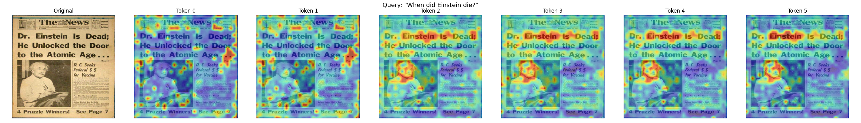
### Step 4: Visualize Multiple Query Tokens
Let's create a side-by-side visualization of what each query token focuses on:
```python
def visualize_query_tokens(image_path, query, model, num_tokens_to_show=5):
"""Visualize similarity maps for each query token."""
# Generate embeddings
doc_vectors = next(model.embed_image([image_path]))
query_vectors = next(model.embed_text(query))
# Compute similarity maps
similarity_maps = compute_all_similarity_maps(query_vectors, doc_vectors)
# Load original image
original_image = Image.open(image_path).convert("RGB").resize((448, 448))
# Limit number of tokens to display
n_tokens = min(len(similarity_maps), num_tokens_to_show)
# Create figure
fig, axes = plt.subplots(1, n_tokens + 1, figsize=(4 * (n_tokens + 1), 4))
# Show original image
axes[0].imshow(original_image)
axes[0].set_title("Original")
axes[0].axis("off")
# Show heatmap for each token
for i in range(n_tokens):
overlay, _ = create_heatmap_overlay(original_image, similarity_maps[i])
axes[i + 1].imshow(overlay)
axes[i + 1].set_title(f"Token {i}")
axes[i + 1].axis("off")
plt.suptitle(f'Query: "{query}"', fontsize=14)
plt.tight_layout()
plt.show()
# Visualize what each token focuses on
visualize_query_tokens(
"images/einstein-newspaper.jpg",
"When did Einstein die?",
model,
num_tokens_to_show=6
)
```
## Practical Example: Debugging a Search
Visual interpretability becomes powerful when debugging search results. Let's walk through a complete example to understand why certain documents match (or don't match) specific queries.
### Scenario: Investigating an Unexpected Match
Imagine you're searching for "bar chart showing revenue" and get an unexpected result. Let's visualize what's happening:
```python
from transformers import AutoTokenizer
# Load tokenizer for ColPali (based on PaliGemma)
tokenizer = AutoTokenizer.from_pretrained("google/paligemma-3b-pt-224")
def debug_search_result(image_path, query, model, tokenizer):
"""Debug why a document matched a query."""
# Generate embeddings
doc_vectors = next(model.embed_image([image_path]))
query_vectors = next(model.embed_text(query))
# Tokenize query to get actual token strings
# ColPali uses "Query: " prefix internally
query_with_prefix = f"Query: {query}"
tokens = tokenizer.tokenize(query_with_prefix)
# Compute MaxSim score
similarities = np.dot(query_vectors, doc_vectors.T)
max_sims = similarities.max(axis=1)
total_score = max_sims.sum()
print(f"Query: {query}")
print(f"Total MaxSim Score: {total_score:.2f}")
print(f"\nPer-token contributions:")
# Show contribution of each token
for i, (max_sim, token_sims) in enumerate(zip(max_sims, similarities)):
# Find which patch this token matched best with
best_patch_idx = token_sims[:1024].argmax()
row, col = best_patch_idx // 32, best_patch_idx % 32
# Display actual token text (fall back to index if out of range)
token_str = tokens[i] if i < len(tokens) else f"[pad_{i}]"
print(f" '{token_str}': score={max_sim:.3f}, best match at patch ({row}, {col})")
return total_score, max_sims
# Debug the search result
score, token_scores = debug_search_result(
"images/financial-report.png",
"bar chart showing revenue",
model,
tokenizer
)
```
This analysis shows you:
- The total relevance score
- How much each query token contributes
- Where in the document each token found its best match
If a token like "revenue" is matching in an unexpected location, the visualization reveals whether the model is correctly identifying revenue-related content or making an error.
### Interpreting the Results
When analyzing heatmaps:
- **Concentrated heat**: The token is focusing on a specific region - good for precise matches
- **Diffuse heat**: The token finds multiple relevant regions or isn't strongly matched anywhere
- **Unexpected locations**: May indicate the model is matching based on visual similarity rather than semantic meaning
## Aggregated MaxSim Visualization
Sometimes you want to see which patches contribute most to the overall score, regardless of which query token they matched. This **aggregated MaxSim view** shows the document-level relevance:
```python
def compute_maxsim_contribution(query_vectors, doc_vectors):
"""Compute how much each patch contributes to the MaxSim score."""
# Use only patch embeddings
patch_vectors = doc_vectors[:1024]
# Compute all pairwise similarities
similarities = np.dot(query_vectors, patch_vectors.T) # (n_query, 1024)
# For each patch, take the maximum contribution across all query tokens
# This shows which patches are most "useful" for any query token
max_contribution = similarities.max(axis=0) # (1024,)
# Reshape to spatial grid
contribution_map = max_contribution.reshape(32, 32)
return contribution_map
def visualize_maxsim_contribution(image_path, query, model):
"""Visualize which patches contribute most to the MaxSim score."""
# Generate embeddings
doc_vectors = next(model.embed_image([image_path]))
query_vectors = next(model.embed_text(query))
# Compute contribution map
contribution_map = compute_maxsim_contribution(query_vectors, doc_vectors)
# Create visualization
original_image = Image.open(image_path).convert("RGB").resize((448, 448))
overlay, _ = create_heatmap_overlay(original_image, contribution_map)
fig, axes = plt.subplots(1, 2, figsize=(10, 5))
axes[0].imshow(original_image)
axes[0].set_title("Original Document")
axes[0].axis("off")
axes[1].imshow(overlay)
axes[1].set_title(f"MaxSim Contribution\nQuery: \"{query}\"")
axes[1].axis("off")
plt.tight_layout()
plt.show()
# Visualize overall contribution
visualize_maxsim_contribution(
"images/einstein-newspaper.jpg",
"When did Einstein die?",
model
)
```
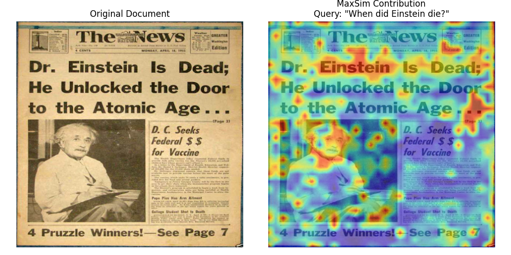
This aggregated view is particularly useful for:
- **Understanding document-level relevance**: See which regions make this document match the query
- **Identifying key content**: Highlights the most semantically important patches
- **Quality assessment**: Check if the model focuses on relevant content (text, diagrams) rather than noise
## A Note on Newer Architectures
The interpretability techniques we've covered work directly with ColPali because of its simple spatial mapping: 448×448 pixels -> 32×32 patches -> 1024 embeddings. Each patch index maps directly to a spatial location.
However, **newer architectures use more complex image processing** that makes precise visualization more challenging.
### Split-Image Processing
Models like ColModernVBERT and ColIdefics3 use a **split-image approach**:
1. **Resize**: The image is resized to fit a maximum edge constraint (e.g., 1344 pixels)
2. **Split into sub-patches**: The resized image is divided into fixed-size sub-patches (typically 512×512 pixels)
3. **Token grids per sub-patch**: Each sub-patch becomes a grid of tokens (e.g., 8×8 = 64 tokens)
4. **Global patch**: A downscaled view of the entire image is appended as a final set of tokens
This means tokens arrive in **sub-patch-sequential order** rather than row-major spatial order. To reconstruct spatial correspondence for visualization, you need to:
1. Exclude the global patch tokens (they lack spatial correspondence to specific regions)
2. Rearrange tokens from sub-patch order back to a 2D spatial grid
3. Account for varying image dimensions (different images produce different numbers of sub-patches)
The core insight remains: **multi-vector representations enable interpretability** because each embedding has semantic meaning. The mapping from embedding to image location just becomes more involved with advanced architectures.
## What's Next
You've now learned one of ColPali's most powerful features: the ability to see exactly where the model focuses when matching queries to documents. This transparency helps you:
- Debug unexpected search results
- Build trust in your retrieval system
- Understand model behavior and limitations
- Validate that the model focuses on relevant content
With a solid understanding of how ColPali works, the model variants available, and how to interpret what the model sees, you're ready to tackle the next challenge: **making these systems production-ready**.
In Module 3, we'll explore the scalability and optimization techniques you need for real-world deployments - from memory optimization and quantization to multi-stage retrieval pipelines that can handle millions of documents efficiently.
---
## The Key Insight: Spatial Correspondence
In the [previous lesson on ColPali's architecture](/course/multi-vector-search/module-2/how-colpali-works/index.md), you learned that ColPali divides images into a 32×32 grid of patches:
- **Input image**: 448×448 pixels
- **Patch size**: 14×14 pixels
- **Patch grid**: 32×32 patches
- **Total patch embeddings**: 1024 vectors
The crucial insight for interpretability is that **each embedding maintains a known spatial location**. Patch index `i` (where `i` ranges from 0 to 1023) maps directly to a position in the grid:
$$
\text{row} = \left\lfloor \frac{i}{32} \right\rfloor
$$
$$
\text{col} = i \mod 32
$$
This position corresponds to a specific pixel region in the original image:
$$
\text{pixel\_region} = \text{image}\left[\text{row} \cdot 14 : (\text{row}+1) \cdot 14, \; \text{col} \cdot 14 : (\text{col}+1) \cdot 14\right]
$$
This spatial correspondence is what makes visual interpretability possible. When a query token has high similarity with a particular patch embedding, we know exactly where in the document that match occurred.
## Computing Token-Patch Similarities
To visualize what ColPali focuses on, we compute the similarity between each query token and all document patches. For a given query token embedding, we can calculate its similarity with each of the 1024 patch embeddings:
```python
import numpy as np
def compute_similarity_map(query_token_vec, doc_vectors):
"""Compute similarity map for a single query token."""
# Take only the 1024 patch embeddings (excluding instruction tokens)
patch_vectors = doc_vectors[:1024]
# Compute dot product similarity with all patches
similarities = np.dot(patch_vectors, query_token_vec)
# Reshape to 32×32 spatial grid
return similarities.reshape(32, 32)
```
The result is a 32×32 similarity map - essentially a heatmap showing where in the document this particular query token has the strongest matches. High values indicate regions where the model finds semantic relevance to that token.
## Manual Implementation with FastEmbed
Let's build a complete interpretability system from scratch using only FastEmbed and standard Python libraries. This approach works with any late interaction model and gives you full control over the visualization process.
### Step 1: Generate Embeddings
First, let's load a model and generate embeddings for both a document image and a query:
```python
from fastembed import LateInteractionMultimodalEmbedding
# Load ColPali model
model = LateInteractionMultimodalEmbedding(
model_name="Qdrant/colpali-v1.3-fp16"
)
# Load and embed a document image
image_path = "images/einstein-newspaper.jpg"
doc_vectors = next(model.embed_image([image_path]))
# Embed a query
query = "When did Einstein die?"
query_vectors = next(model.embed_text(query))
print(f"Document embeddings shape: {doc_vectors.shape}") # (1030, 128)
print(f"Query embeddings shape: {query_vectors.shape}") # (N, 128) where N = number of tokens
```
### Step 2: Compute Similarity Maps for All Query Tokens
Now we compute a similarity map for each query token:
```python
def compute_all_similarity_maps(query_vectors, doc_vectors):
"""Compute similarity maps for all query tokens."""
return np.array([
compute_similarity_map(query_token_vec, doc_vectors)
for query_token_vec in query_vectors
])
# Compute similarity maps
similarity_maps = compute_all_similarity_maps(query_vectors, doc_vectors)
print(f"Similarity maps shape: {similarity_maps.shape}") # (N, 32, 32)
```
## Creating Heatmap Visualizations
To visualize the similarity maps, we need to:
1. Upsample the 32×32 map to match the image dimensions
2. Overlay it as a semi-transparent heatmap on the original image
### Step 3: Upsample and Overlay
```python
from scipy.ndimage import zoom
import matplotlib.pyplot as plt
import matplotlib.cm as cm
def create_heatmap_overlay(image, similarity_map, alpha=0.5):
"""Create a heatmap overlay on the original image."""
# Ensure image is in RGB and resized to 448×448 (ColPali's input size)
if isinstance(image, str):
image = Image.open(image)
image = image.convert("RGB").resize((448, 448))
image_array = np.array(image)
# Upsample similarity map from 32×32 to 448×448
# zoom factor = 448/32 = 14
# Convert to float64 as scipy.ndimage.zoom doesn't support all dtypes (e.g., float16)
upsampled_map = zoom(similarity_map.astype(np.float64), 14, order=1)
# Normalize to [0, 1] range
min_val = upsampled_map.min()
max_val = upsampled_map.max()
if max_val > min_val:
normalized_map = (upsampled_map - min_val) / (max_val - min_val)
else:
normalized_map = np.zeros_like(upsampled_map)
# Apply colormap (using 'jet' for red=high, blue=low)
heatmap = cm.jet(normalized_map)[:, :, :3] # Remove alpha channel
heatmap = (heatmap * 255).astype(np.uint8)
# Blend with original image
blended = (alpha * heatmap + (1 - alpha) * image_array).astype(np.uint8)
return Image.fromarray(blended), normalized_map
```
### Step 4: Visualize Multiple Query Tokens
Let's create a side-by-side visualization of what each query token focuses on:
```python
def visualize_query_tokens(image_path, query, model, num_tokens_to_show=5):
"""Visualize similarity maps for each query token."""
# Generate embeddings
doc_vectors = next(model.embed_image([image_path]))
query_vectors = next(model.embed_text(query))
# Compute similarity maps
similarity_maps = compute_all_similarity_maps(query_vectors, doc_vectors)
# Load original image
original_image = Image.open(image_path).convert("RGB").resize((448, 448))
# Limit number of tokens to display
n_tokens = min(len(similarity_maps), num_tokens_to_show)
# Create figure
fig, axes = plt.subplots(1, n_tokens + 1, figsize=(4 * (n_tokens + 1), 4))
# Show original image
axes[0].imshow(original_image)
axes[0].set_title("Original")
axes[0].axis("off")
# Show heatmap for each token
for i in range(n_tokens):
overlay, _ = create_heatmap_overlay(original_image, similarity_maps[i])
axes[i + 1].imshow(overlay)
axes[i + 1].set_title(f"Token {i}")
axes[i + 1].axis("off")
plt.suptitle(f'Query: "{query}"', fontsize=14)
plt.tight_layout()
plt.show()
# Visualize what each token focuses on
visualize_query_tokens(
"images/einstein-newspaper.jpg",
"When did Einstein die?",
model,
num_tokens_to_show=6
)
```

## Practical Example: Debugging a Search
Visual interpretability becomes powerful when debugging search results. Let's walk through a complete example to understand why certain documents match (or don't match) specific queries.
### Scenario: Investigating an Unexpected Match
Imagine you're searching for "bar chart showing revenue" and get an unexpected result. Let's visualize what's happening:
```python
from transformers import AutoTokenizer
# Load tokenizer for ColPali (based on PaliGemma)
tokenizer = AutoTokenizer.from_pretrained("google/paligemma-3b-pt-224")
def debug_search_result(image_path, query, model, tokenizer):
"""Debug why a document matched a query."""
# Generate embeddings
doc_vectors = next(model.embed_image([image_path]))
query_vectors = next(model.embed_text(query))
# Tokenize query to get actual token strings
# ColPali uses "Query: " prefix internally
query_with_prefix = f"Query: {query}"
tokens = tokenizer.tokenize(query_with_prefix)
# Compute MaxSim score
similarities = np.dot(query_vectors, doc_vectors.T)
max_sims = similarities.max(axis=1)
total_score = max_sims.sum()
print(f"Query: {query}")
print(f"Total MaxSim Score: {total_score:.2f}")
print(f"\nPer-token contributions:")
# Show contribution of each token
for i, (max_sim, token_sims) in enumerate(zip(max_sims, similarities)):
# Find which patch this token matched best with
best_patch_idx = token_sims[:1024].argmax()
row, col = best_patch_idx // 32, best_patch_idx % 32
# Display actual token text (fall back to index if out of range)
token_str = tokens[i] if i < len(tokens) else f"[pad_{i}]"
print(f" '{token_str}': score={max_sim:.3f}, best match at patch ({row}, {col})")
return total_score, max_sims
# Debug the search result
score, token_scores = debug_search_result(
"images/financial-report.png",
"bar chart showing revenue",
model,
tokenizer
)
```
This analysis shows you:
- The total relevance score
- How much each query token contributes
- Where in the document each token found its best match
If a token like "revenue" is matching in an unexpected location, the visualization reveals whether the model is correctly identifying revenue-related content or making an error.
### Interpreting the Results
When analyzing heatmaps:
- **Concentrated heat**: The token is focusing on a specific region - good for precise matches
- **Diffuse heat**: The token finds multiple relevant regions or isn't strongly matched anywhere
- **Unexpected locations**: May indicate the model is matching based on visual similarity rather than semantic meaning
## Aggregated MaxSim Visualization
Sometimes you want to see which patches contribute most to the overall score, regardless of which query token they matched. This **aggregated MaxSim view** shows the document-level relevance:
```python
def compute_maxsim_contribution(query_vectors, doc_vectors):
"""Compute how much each patch contributes to the MaxSim score."""
# Use only patch embeddings
patch_vectors = doc_vectors[:1024]
# Compute all pairwise similarities
similarities = np.dot(query_vectors, patch_vectors.T) # (n_query, 1024)
# For each patch, take the maximum contribution across all query tokens
# This shows which patches are most "useful" for any query token
max_contribution = similarities.max(axis=0) # (1024,)
# Reshape to spatial grid
contribution_map = max_contribution.reshape(32, 32)
return contribution_map
def visualize_maxsim_contribution(image_path, query, model):
"""Visualize which patches contribute most to the MaxSim score."""
# Generate embeddings
doc_vectors = next(model.embed_image([image_path]))
query_vectors = next(model.embed_text(query))
# Compute contribution map
contribution_map = compute_maxsim_contribution(query_vectors, doc_vectors)
# Create visualization
original_image = Image.open(image_path).convert("RGB").resize((448, 448))
overlay, _ = create_heatmap_overlay(original_image, contribution_map)
fig, axes = plt.subplots(1, 2, figsize=(10, 5))
axes[0].imshow(original_image)
axes[0].set_title("Original Document")
axes[0].axis("off")
axes[1].imshow(overlay)
axes[1].set_title(f"MaxSim Contribution\nQuery: \"{query}\"")
axes[1].axis("off")
plt.tight_layout()
plt.show()
# Visualize overall contribution
visualize_maxsim_contribution(
"images/einstein-newspaper.jpg",
"When did Einstein die?",
model
)
```

This aggregated view is particularly useful for:
- **Understanding document-level relevance**: See which regions make this document match the query
- **Identifying key content**: Highlights the most semantically important patches
- **Quality assessment**: Check if the model focuses on relevant content (text, diagrams) rather than noise
## A Note on Newer Architectures
The interpretability techniques we've covered work directly with ColPali because of its simple spatial mapping: 448×448 pixels -> 32×32 patches -> 1024 embeddings. Each patch index maps directly to a spatial location.
However, **newer architectures use more complex image processing** that makes precise visualization more challenging.
### Split-Image Processing
Models like ColModernVBERT and ColIdefics3 use a **split-image approach**:
1. **Resize**: The image is resized to fit a maximum edge constraint (e.g., 1344 pixels)
2. **Split into sub-patches**: The resized image is divided into fixed-size sub-patches (typically 512×512 pixels)
3. **Token grids per sub-patch**: Each sub-patch becomes a grid of tokens (e.g., 8×8 = 64 tokens)
4. **Global patch**: A downscaled view of the entire image is appended as a final set of tokens
This means tokens arrive in **sub-patch-sequential order** rather than row-major spatial order. To reconstruct spatial correspondence for visualization, you need to:
1. Exclude the global patch tokens (they lack spatial correspondence to specific regions)
2. Rearrange tokens from sub-patch order back to a 2D spatial grid
3. Account for varying image dimensions (different images produce different numbers of sub-patches)
The core insight remains: **multi-vector representations enable interpretability** because each embedding has semantic meaning. The mapping from embedding to image location just becomes more involved with advanced architectures.
## What's Next
You've now learned one of ColPali's most powerful features: the ability to see exactly where the model focuses when matching queries to documents. This transparency helps you:
- Debug unexpected search results
- Build trust in your retrieval system
- Understand model behavior and limitations
- Validate that the model focuses on relevant content
With a solid understanding of how ColPali works, the model variants available, and how to interpret what the model sees, you're ready to tackle the next challenge: **making these systems production-ready**.
In Module 3, we'll explore the scalability and optimization techniques you need for real-world deployments - from memory optimization and quantization to multi-stage retrieval pipelines that can handle millions of documents efficiently.