Data Exploration with Qdrant's Distance Matrix API
Andrey Vasnetsov
·March 11, 2025

Hidden Structure
When working with large collections of documents, images, or other arrays of unstructured data, it often becomes useful to understand the big picture. Examining data points individually is not always the best way to grasp the structure of the data.

Datapoints without context, pretty much useless
As numbers in a table obtain meaning when plotted on a graph, visualising distances (similar/dissimilar) between unstructured data items can reveal hidden structures and patterns.
Visualized chart, very intuitive
In many implementations, the distance matrix calculation was part of the clustering or visualization processes, requiring either brute-force computation or building a temporary index. With Qdrant, however, the data is already indexed, and the distance matrix can be computed relatively cheaply.
In this article, we will explore several methods for data exploration using the Distance Matrix API.
Dimensionality Reduction
Initially, we might want to visualize an entire dataset, or at least a large portion of it, at a glance. However, high-dimensional data cannot be directly visualized. We must apply dimensionality reduction techniques to convert data into a lower-dimensional representation while preserving important data properties.
In this article, we will use UMAP as our dimensionality reduction algorithm.
Here is a very simplified but intuitive explanation of UMAP:
- Randomly generate points in 2D space: Assign a random 2D point to each high-dimensional point.
- Compute distance matrix for high-dimensional points: Calculate distances between all pairs of points.
- Compute distance matrix for 2D points: Perform similarly to step 2.
- Match both distance matrices: Adjust 2D points to minimize differences.
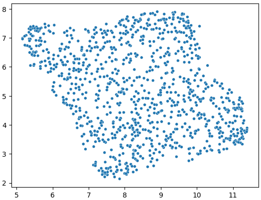
Canonical example of UMAP results, source
UMAP preserves the relative distances between high-dimensional points; the actual coordinates are not essential. If we already have the distance matrix, step 2 can be skipped entirely.
Let’s use Qdrant to calculate the distance matrix and apply UMAP. We will use one of the default datasets perfect for experimenting in Qdrant–Midjourney Styles dataset.
Use this command to download and import the dataset into Qdrant:
PUT /collections/midlib/snapshots/recover
{
  "location": "http://snapshots.qdrant.io/midlib.snapshot"
}
We also need to prepare our python environment:
pip install umap-learn seaborn matplotlib qdrant-client
Import the necessary libraries:
# Used to talk to Qdrant
from qdrant_client import QdrantClient
# Package with original UMAP implementation
from umap import UMAP
# Python implementation for sparse matrices
from scipy.sparse import csr_matrix
# For visualization
import seaborn as sns
Establish connection to Qdrant:
client = QdrantClient("http://localhost:6333")
After this is done, we can compute the distance matrix:
# Request distances matrix from Qdrant
# `_offsets` suffix defines a format of the output matrix.
result = client.search_matrix_offsets(
  collection_name="midlib",
  sample=1000, # Select a subset of the data, as the whole dataset might be too large
  limit=20, # For performance reasons, limit the number of closest neighbors to consider
)

# Convert distances matrix to python-native format
matrix = csr_matrix(
    (result.scores, (result.offsets_row, result.offsets_col))
)

# Make the matrix symmetric, as UMAP expects it.
# Distance matrix is always symmetric, but qdrant only computes half of it.
matrix = matrix + matrix.T
Now we can apply UMAP to the distance matrix:
umap = UMAP(
    metric="precomputed", # We provide ready-made distance matrix
    n_components=2, # output dimension
    n_neighbors=20, # Same as the limit in the search_matrix_offsets
)

vectors_2d = umap.fit_transform(matrix)
That’s all that is needed to get the 2d representation of the data.
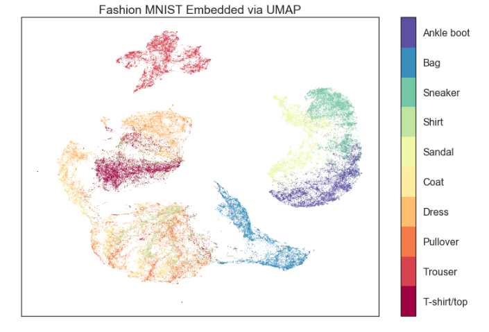
UMAP applied to Midlib dataset
UMAP isn’t the only algorithm compatible with our distance matrix API. For example, scikit-learn also offers:
- Isomap - Non-linear dimensionality reduction through Isometric Mapping.
- SpectralEmbedding - Forms an affinity matrix given by the specified function and applies spectral decomposition to the corresponding graph Laplacian.
- TSNE - well-known algorithm for dimensionality reduction.
Clustering
Another approach to data structure understanding is clustering–grouping similar items.
Note that there’s no universally best clustering criterion or algorithm.
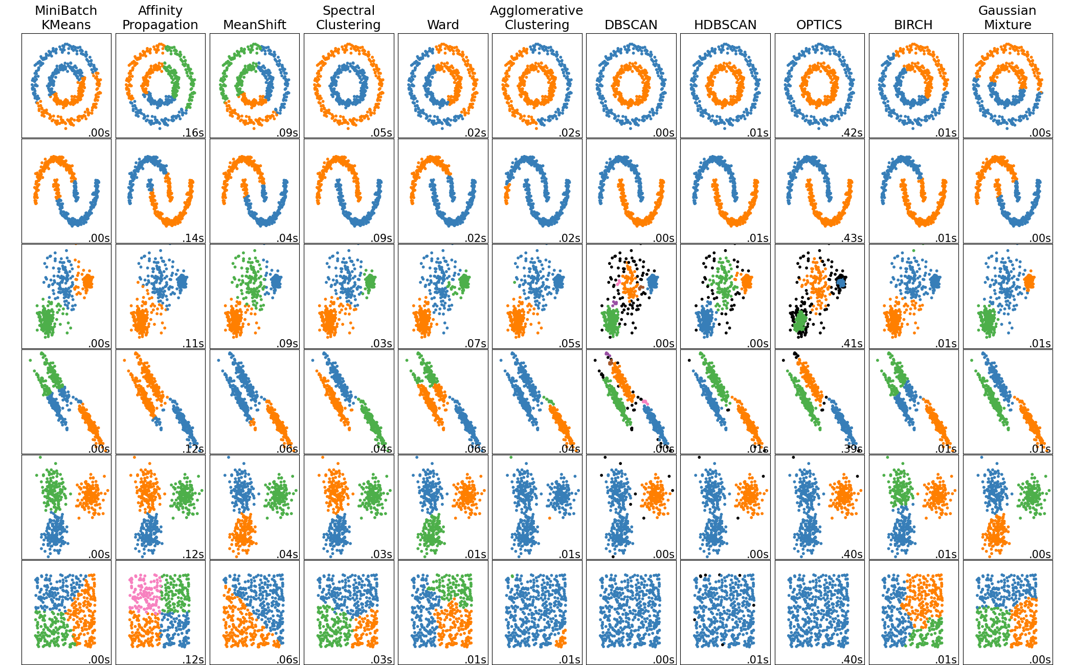
Clustering example, source
Many clustering algorithms accept precomputed distance matrix as input, so we can use the same distance matrix we calculated before.
Let’s consider a simple example of clustering the Midlib dataset with KMeans algorithm.
From scikit-learn.cluster documentation we know that fit() method of KMeans algorithm prefers as an input:
X : {array-like, sparse matrix} of shape (n_samples, n_features):
Training instances to cluster. It must be noted that the data will be converted to C ordering, which will cause a memory copy if the given data is not C-contiguous. If a sparse matrix is passed, a copy will be made if it’s not in CSR format.
So we can re-use matrix from the previous example:
from sklearn.cluster import KMeans

# Initialize KMeans with 10 clusters
kmeans = KMeans(n_clusters=10)

# Generate index of the cluster each sample belongs to
cluster_labels = kmeans.fit_predict(matrix)
With this simple code, we have clustered the data into 10 clusters, while the main CPU-intensive part of the process was done by Qdrant.
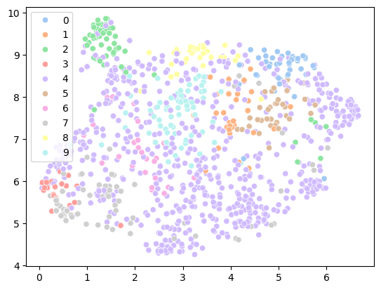
Clustering applied to Midlib dataset
How to plot this chart
sns.scatterplot(
    # Coordinates obtained from UMAP
    x=vectors_2d[:, 0], y=vectors_2d[:, 1],
    # Color datapoints by cluster
    hue=cluster_labels,
    palette=sns.color_palette("pastel", 10),
    legend="full",
)
Graphs
Clustering and dimensionality reduction both aim to provide a more transparent overview of the data. However, they share a common characteristic - they require a training step before the results can be visualized.
This also implies that introducing new data points necessitates re-running the training step, which may be computationally expensive.
Graphs offer an alternative approach to data exploration, enabling direct, interactive visualization of relationships between data points. In a graph representation, each data point is a node, and similarities between data points are represented as edges connecting the nodes.
Such a graph can be rendered in real-time using force-directed layout algorithms, which aim to minimize the system’s energy by repositioning nodes dynamically–the more similar the data points are, the stronger the edges between them.
Adding new data points to the graph is as straightforward as inserting new nodes and edges without the need to re-run any training steps.
In practice, rendering a graph for an entire dataset at once may be computationally expensive and overwhelming for the user. Therefore, let’s explore a few strategies to address this issue.
Expanding from a single node
This is the simplest approach, where we start with a single node and expand the graph by adding the most similar nodes to the graph.

Graph representation of the data
Sampling from a collection
Expanding a single node works well if you want to explore neighbors of a single point, but what if you want to explore the whole dataset? If your dataset is small enough, you can render relations for all the data points at once. But it is a rare case in practice.
Instead, we can sample a subset of the data and render the graph for this subset. This way, we can get a good overview of the data without overwhelming the user with too much information.
Let’s try to do so in Qdrant’s Graph Exploration Tool:
{
  "limit": 5, # node neighbors to consider
  "sample": 100 # nodes
}
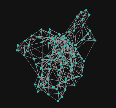
Graph representation of the data (Qdrant’s Graph Exploration Tool)
This graph captures some high-level structure of the data, but as you might have noticed, it is quite noisy. This is because the differences in similarities are relatively small, and they might be overwhelmed by the stretches and compressions of the force-directed layout algorithm.
To make the graph more readable, let’s concentrate on the most important similarities and build a so called Minimum/Maximum Spanning Tree.
{
  "limit": 5,
  "sample": 100,
  "tree": true
}
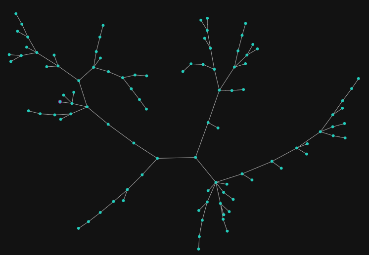
Spanning tree of the graph (Qdrant’s Graph Exploration Tool)
This algorithm will only keep the most important edges and remove the rest while keeping the graph connected. By doing so, we can reveal clusters of the data and the most important relations between them.
In some sense, this is similar to hierarchical clustering, but with the ability to interactively explore the data. Another analogy might be a dynamically constructed mind map.
Conclusion
Vector similarity goes beyond looking up the nearest neighbors–it provides a powerful tool for data exploration. Many algorithms can construct human-readable data representations, and Qdrant makes using them easy.
Several data exploration instruments are available in the Qdrant Web UI (Visualization and Graph Exploration Tools), and for more advanced use cases, you could directly utilise our distance matrix API.
Try it with your data and see what hidden structures you can reveal!