Visual Interpretability of ColPali
Why did this document match my query? Unlike traditional black-box embedding models that produce a single opaque vector, ColPali’s multi-vector architecture offers something remarkable: you can see exactly where the model “looks” when matching a query to a document.
This visual interpretability is invaluable for building trust in multi-modal search systems, debugging unexpected results, and understanding model behavior and limitations.
Follow along in Colab: ![]()
The Key Insight: Spatial Correspondence
In the previous lesson on ColPali’s architecture, you learned that ColPali divides images into a 32×32 grid of patches:
- Input image: 448×448 pixels
- Patch size: 14×14 pixels
- Patch grid: 32×32 patches
- Total patch embeddings: 1024 vectors
The crucial insight for interpretability is that each embedding maintains a known spatial location. Patch index i (where i ranges from 0 to 1023) maps directly to a position in the grid:
This position corresponds to a specific pixel region in the original image:
This spatial correspondence is what makes visual interpretability possible. When a query token has high similarity with a particular patch embedding, we know exactly where in the document that match occurred.
Computing Token-Patch Similarities
To visualize what ColPali focuses on, we compute the similarity between each query token and all document patches. For a given query token embedding, we can calculate its similarity with each of the 1024 patch embeddings:
import numpy as np

def compute_similarity_map(query_token_vec, doc_vectors):
    """Compute similarity map for a single query token."""
    # Take only the 1024 patch embeddings (excluding instruction tokens)
    patch_vectors = doc_vectors[:1024]

    # Compute dot product similarity with all patches
    similarities = np.dot(patch_vectors, query_token_vec)

    # Reshape to 32×32 spatial grid
    return similarities.reshape(32, 32)
The result is a 32×32 similarity map - essentially a heatmap showing where in the document this particular query token has the strongest matches. High values indicate regions where the model finds semantic relevance to that token.
Manual Implementation with FastEmbed
Let’s build a complete interpretability system from scratch using only FastEmbed and standard Python libraries. This approach works with any late interaction model and gives you full control over the visualization process.
Step 1: Generate Embeddings
First, let’s load a model and generate embeddings for both a document image and a query:
from fastembed import LateInteractionMultimodalEmbedding

# Load ColPali model
model = LateInteractionMultimodalEmbedding(
    model_name="Qdrant/colpali-v1.3-fp16"
)

# Load and embed a document image
image_path = "images/einstein-newspaper.jpg"
doc_vectors = next(model.embed_image([image_path]))

# Embed a query
query = "When did Einstein die?"
query_vectors = next(model.embed_text(query))

print(f"Document embeddings shape: {doc_vectors.shape}")  # (1030, 128)
print(f"Query embeddings shape: {query_vectors.shape}")    # (N, 128) where N = number of tokens
Step 2: Compute Similarity Maps for All Query Tokens
Now we compute a similarity map for each query token:
def compute_all_similarity_maps(query_vectors, doc_vectors):
    """Compute similarity maps for all query tokens."""
    return np.array([
        compute_similarity_map(query_token_vec, doc_vectors)
        for query_token_vec in query_vectors
    ])

# Compute similarity maps
similarity_maps = compute_all_similarity_maps(query_vectors, doc_vectors)
print(f"Similarity maps shape: {similarity_maps.shape}")  # (N, 32, 32)
Creating Heatmap Visualizations
To visualize the similarity maps, we need to:
- Upsample the 32×32 map to match the image dimensions
- Overlay it as a semi-transparent heatmap on the original image
Step 3: Upsample and Overlay
from scipy.ndimage import zoom
import matplotlib.pyplot as plt
import matplotlib.cm as cm

def create_heatmap_overlay(image, similarity_map, alpha=0.5):
    """Create a heatmap overlay on the original image."""
    # Ensure image is in RGB and resized to 448×448 (ColPali's input size)
    if isinstance(image, str):
        image = Image.open(image)
    image = image.convert("RGB").resize((448, 448))
    image_array = np.array(image)

    # Upsample similarity map from 32×32 to 448×448
    # zoom factor = 448/32 = 14
    # Convert to float64 as scipy.ndimage.zoom doesn't support all dtypes (e.g., float16)
    upsampled_map = zoom(similarity_map.astype(np.float64), 14, order=1)

    # Normalize to [0, 1] range
    min_val = upsampled_map.min()
    max_val = upsampled_map.max()
    if max_val > min_val:
        normalized_map = (upsampled_map - min_val) / (max_val - min_val)
    else:
        normalized_map = np.zeros_like(upsampled_map)

    # Apply colormap (using 'jet' for red=high, blue=low)
    heatmap = cm.jet(normalized_map)[:, :, :3]  # Remove alpha channel
    heatmap = (heatmap * 255).astype(np.uint8)

    # Blend with original image
    blended = (alpha * heatmap + (1 - alpha) * image_array).astype(np.uint8)

    return Image.fromarray(blended), normalized_map
Step 4: Visualize Multiple Query Tokens
Let’s create a side-by-side visualization of what each query token focuses on:
def visualize_query_tokens(image_path, query, model, num_tokens_to_show=5):
"""Visualize similarity maps for each query token."""
# Generate embeddings
doc_vectors = next(model.embed_image([image_path]))
query_vectors = next(model.embed_text(query))
# Compute similarity maps
similarity_maps = compute_all_similarity_maps(query_vectors, doc_vectors)
# Load original image
original_image = Image.open(image_path).convert("RGB").resize((448, 448))
# Limit number of tokens to display
n_tokens = min(len(similarity_maps), num_tokens_to_show)
# Create figure
fig, axes = plt.subplots(1, n_tokens + 1, figsize=(4 * (n_tokens + 1), 4))
# Show original image
axes[0].imshow(original_image)
axes[0].set_title("Original")
axes[0].axis("off")
# Show heatmap for each token
for i in range(n_tokens):
overlay, _ = create_heatmap_overlay(original_image, similarity_maps[i])
axes[i + 1].imshow(overlay)
axes[i + 1].set_title(f"Token {i}")
axes[i + 1].axis("off")
plt.suptitle(f'Query: "{query}"', fontsize=14)
plt.tight_layout()
plt.show()
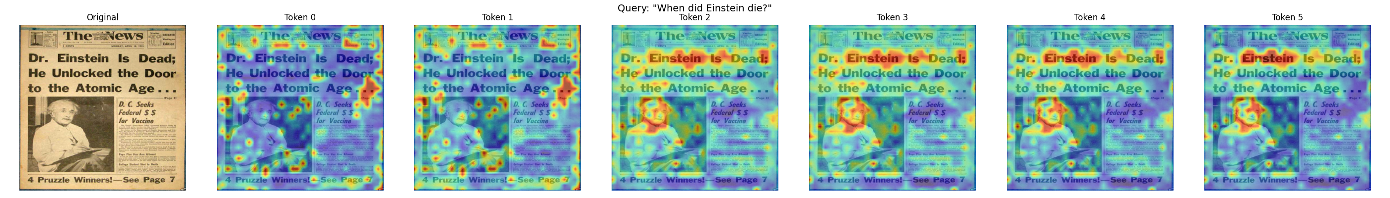
# Visualize what each token focuses on
visualize_query_tokens(
"images/einstein-newspaper.jpg",
"When did Einstein die?",
model,
num_tokens_to_show=6
)
Practical Example: Debugging a Search
Visual interpretability becomes powerful when debugging search results. Let’s walk through a complete example to understand why certain documents match (or don’t match) specific queries.
Scenario: Investigating an Unexpected Match
Imagine you’re searching for “bar chart showing revenue” and get an unexpected result. Let’s visualize what’s happening:
from transformers import AutoTokenizer

# Load tokenizer for ColPali (based on PaliGemma)
tokenizer = AutoTokenizer.from_pretrained("google/paligemma-3b-pt-224")

def debug_search_result(image_path, query, model, tokenizer):
    """Debug why a document matched a query."""
    # Generate embeddings
    doc_vectors = next(model.embed_image([image_path]))
    query_vectors = next(model.embed_text(query))

    # Tokenize query to get actual token strings
    # ColPali uses "Query: " prefix internally
    query_with_prefix = f"Query: {query}"
    tokens = tokenizer.tokenize(query_with_prefix)

    # Compute MaxSim score
    similarities = np.dot(query_vectors, doc_vectors.T)
    max_sims = similarities.max(axis=1)
    total_score = max_sims.sum()

    print(f"Query: {query}")
    print(f"Total MaxSim Score: {total_score:.2f}")
    print(f"\nPer-token contributions:")

    # Show contribution of each token
    for i, (max_sim, token_sims) in enumerate(zip(max_sims, similarities)):
        # Find which patch this token matched best with
        best_patch_idx = token_sims[:1024].argmax()
        row, col = best_patch_idx // 32, best_patch_idx % 32
        # Display actual token text (fall back to index if out of range)
        token_str = tokens[i] if i < len(tokens) else f"[pad_{i}]"
        print(f"  '{token_str}': score={max_sim:.3f}, best match at patch ({row}, {col})")

    return total_score, max_sims

# Debug the search result
score, token_scores = debug_search_result(
    "images/financial-report.png",
    "bar chart showing revenue",
    model,
    tokenizer
)
This analysis shows you:
- The total relevance score
- How much each query token contributes
- Where in the document each token found its best match
If a token like “revenue” is matching in an unexpected location, the visualization reveals whether the model is correctly identifying revenue-related content or making an error.
Interpreting the Results
When analyzing heatmaps:
- Concentrated heat: The token is focusing on a specific region - good for precise matches
- Diffuse heat: The token finds multiple relevant regions or isn’t strongly matched anywhere
- Unexpected locations: May indicate the model is matching based on visual similarity rather than semantic meaning
Aggregated MaxSim Visualization
Sometimes you want to see which patches contribute most to the overall score, regardless of which query token they matched. This aggregated MaxSim view shows the document-level relevance:
def compute_maxsim_contribution(query_vectors, doc_vectors):
    """Compute how much each patch contributes to the MaxSim score."""
    # Use only patch embeddings
    patch_vectors = doc_vectors[:1024]

    # Compute all pairwise similarities
    similarities = np.dot(query_vectors, patch_vectors.T)  # (n_query, 1024)

    # For each patch, take the maximum contribution across all query tokens
    # This shows which patches are most "useful" for any query token
    max_contribution = similarities.max(axis=0)  # (1024,)

    # Reshape to spatial grid
    contribution_map = max_contribution.reshape(32, 32)

    return contribution_map

def visualize_maxsim_contribution(image_path, query, model):
    """Visualize which patches contribute most to the MaxSim score."""
    # Generate embeddings
    doc_vectors = next(model.embed_image([image_path]))
    query_vectors = next(model.embed_text(query))

    # Compute contribution map
    contribution_map = compute_maxsim_contribution(query_vectors, doc_vectors)

    # Create visualization
    original_image = Image.open(image_path).convert("RGB").resize((448, 448))
    overlay, _ = create_heatmap_overlay(original_image, contribution_map)

    fig, axes = plt.subplots(1, 2, figsize=(10, 5))

    axes[0].imshow(original_image)
    axes[0].set_title("Original Document")
    axes[0].axis("off")

    axes[1].imshow(overlay)
    axes[1].set_title(f"MaxSim Contribution\nQuery: \"{query}\"")
    axes[1].axis("off")

    plt.tight_layout()
    plt.show()

# Visualize overall contribution
visualize_maxsim_contribution(
    "images/einstein-newspaper.jpg",
    "When did Einstein die?",
    model
)
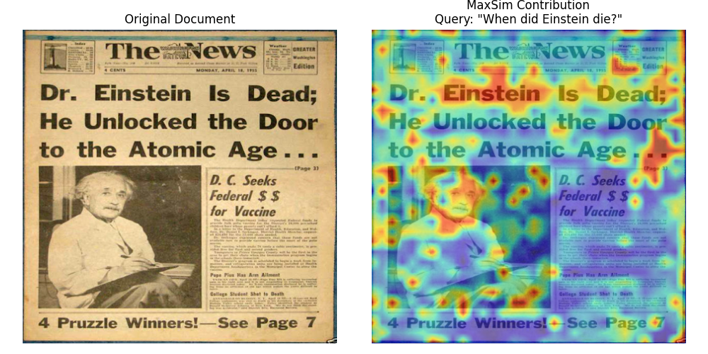
This aggregated view is particularly useful for:
- Understanding document-level relevance: See which regions make this document match the query
- Identifying key content: Highlights the most semantically important patches
- Quality assessment: Check if the model focuses on relevant content (text, diagrams) rather than noise
A Note on Newer Architectures
The interpretability techniques we’ve covered work directly with ColPali because of its simple spatial mapping: 448×448 pixels -> 32×32 patches -> 1024 embeddings. Each patch index maps directly to a spatial location.
However, newer architectures use more complex image processing that makes precise visualization more challenging.
Split-Image Processing
Models like ColModernVBERT and ColIdefics3 use a split-image approach:
- Resize: The image is resized to fit a maximum edge constraint (e.g., 1344 pixels)
- Split into sub-patches: The resized image is divided into fixed-size sub-patches (typically 512×512 pixels)
- Token grids per sub-patch: Each sub-patch becomes a grid of tokens (e.g., 8×8 = 64 tokens)
- Global patch: A downscaled view of the entire image is appended as a final set of tokens
This means tokens arrive in sub-patch-sequential order rather than row-major spatial order. To reconstruct spatial correspondence for visualization, you need to:
- Exclude the global patch tokens (they lack spatial correspondence to specific regions)
- Rearrange tokens from sub-patch order back to a 2D spatial grid
- Account for varying image dimensions (different images produce different numbers of sub-patches)
The core insight remains: multi-vector representations enable interpretability because each embedding has semantic meaning. The mapping from embedding to image location just becomes more involved with advanced architectures.
What’s Next
You’ve now learned one of ColPali’s most powerful features: the ability to see exactly where the model focuses when matching queries to documents. This transparency helps you:
- Debug unexpected search results
- Build trust in your retrieval system
- Understand model behavior and limitations
- Validate that the model focuses on relevant content
With a solid understanding of how ColPali works, the model variants available, and how to interpret what the model sees, you’re ready to tackle the next challenge: making these systems production-ready.
In Module 3, we’ll explore the scalability and optimization techniques you need for real-world deployments - from memory optimization and quantization to multi-stage retrieval pipelines that can handle millions of documents efficiently.